Product Narratives - Holmen


When you're selling three distinct paperboard products - it becomes evident that all marketing assets start to look very similar. Paperboard is just that, right? White, flat and lifeless.
This project had a clear problem to overcome - and it required ( ironically seeing as the products are used in packaging ) some 'out of the box' thinking.
All animations and 3D design: Rasmus Linderos
01
Problem
As a product, paperboard is hard to visualise in a compelling way. It's flat, angular, plain. Quite literally - boring. Holmen Iggesund have three products that look the same, and thats a problem because they're all unique.
03
Solution
Produce a rich collection of brand assets that clearly separates each paperboard product from each other by bringing them to life through animation within their own unique 3d rendered worlds.
02
Idea
Each paperboard product assumes a persona that reflects it's unique properties.
04
Outcome
A stunning collection of 3D rendered videos and images that can be used across all channels when communicating about a specific product.

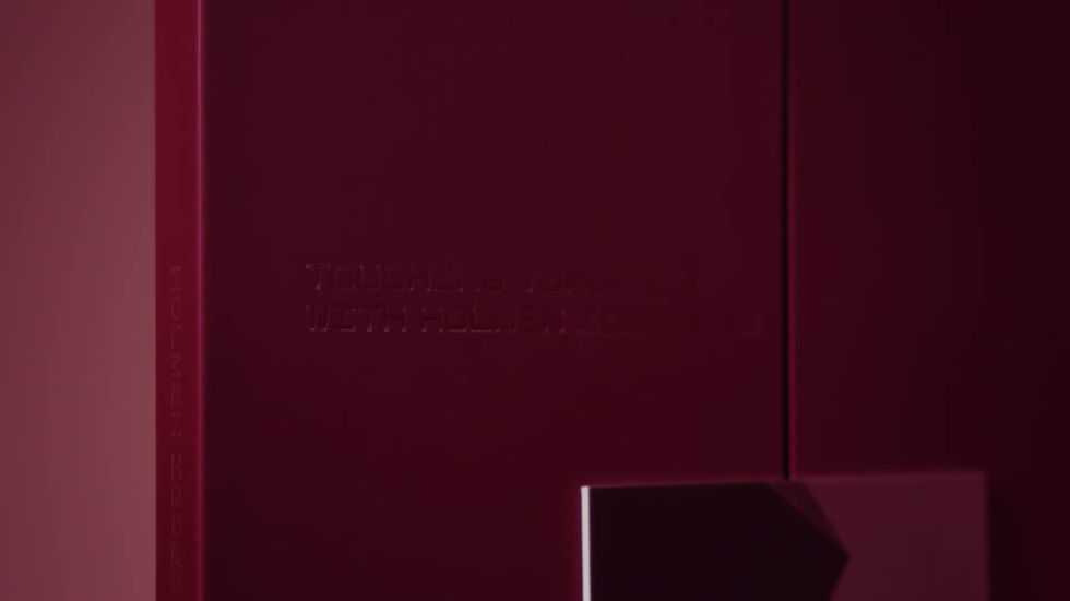
Touching Tomorrow - Holmen


Choosing the right packaging material is crucial for brands, not only to cater for the demands of their product, but to meet environmental targets as well.
This concept invites Holmen Iggesund's customers to discover paperboard materials, techniques and designs through a portfolio featuring the works of talented photographers and paper craft experts.
01
Problem
Reimagine the standard sample swatch book into something that reflects Holmen Iggesund's new brand platform 'Purposeful by Nature'.
03
Solution
Curated photography that tells the unique product stories through their visual style, interpreting 'Touching Tomorrow' as a theme - printed and embellished on their relevant papers.
02
Idea
Produce a product catalogue with a purpose beyond the obvious. Something that you would keep long-term because it has an added value.
04
Outcome
A premium book of professional photography prints, showcasing the product's capabilities through visual storytelling, superior paper quality and boundary pushing finishing techniques.

Sound of Colour - Tikkurila


A new communication concept for Tikkurila's interior paints that turns the soundtracks of our lives into favourite colours.
Most of us can relate our favourite songs to a colourful feeling or experience. Something we have amplified creatively to show that it’s easy and fun to refresh one’s home interior by repainting.
01
Problem
The brief asked for a concept that was playful, joyful and people centric. Something new and unexpected with great storytelling potential that was easy to understand. While still portraying Tikkurila as being the colour experts who know their customers.
03
Solution
Visually and magically link music to colour, portrayed via everyday scenarios at home.
02
Idea
Based on the insight that our senses are intermixed and triggered by each other – commonly known as synaesthesia. Tikkurila illustrate that colour inspiration can be found everywhere, even in music.
04
Outcome
A channel-independent concept where the overarching message and call-out “Tune into a world of colour” creates a cohesive communication for maximum impact.


Beyond Insurance - Vhi


Vhi Healthcare provide a myriad services ‘Beyond’ what’s expected from a health insurance company.
'Our proposition is unique, and the brand now has many more ways to live up to its
long-held promise ‘When you need us, we’re there'
01
Problem
How does a traditional and iconic health insurer communicate they have become much more than that?
03
Solution
Take the audience beyond the known services, through a series of miniature dioramas representing some of the lesser known proof points. All linked through the brand's iconic heart shape which always has something new behind it.
02
Idea
Vhi are moving beyond insurance. This idea has a innate sense of movement to it. Pushing past stagnancy and looking to what's next.
04
Outcome
A fully integrated awareness campaign which highlighted the depth and breadth of the Vhi specialist clinics and care dedicated only to their members.

Leave Nothing Behind - Virgin Media


How do you make a sale sexy? Exciting? Awesome?
Well having Brian Cox as VO is a start...
An annual sale isn’t something that ever captivates audiences. But entertainment
giant Virgin Media needed it to - and fast!
01
Problem
How do we promote a sale with many elements in a new, AWESOMELY heroic yet simple way. Quite the predicament.
03
Solution
A claw machine acts as the central narrative device, which picks up the sale's price point (after being given super powers by virgin media of course). Instead of just one item being carried up, everything inside the machine starts to surprisingly come along too.
02
Idea
Demonstrate to audiences that when they pick up this offer from Virgin Media, they get a deal that keeps on giving until nothing is left behind.
04
Outcome
A successful sale campaign! Very awesome, very Virgin. Job done.
